


ORANGE
FR
Redesign du Logo de Orange : Une Nouvelle Ère de Connexion.
Je suis ravi de partager avec vous ce projet passionnant : le redesign du logo emblématique d'Orange, une véritable ode à la modernité et à la connectivité.
Le Défi:
En entreprenant ce projet, j'ai ressenti la nécessité de rapprocher le logo d'Orange de l'essence même de l'entreprise. L'ancien logo, bien qu'élégant, manquait de la flexibilité et de la modernité nécessaires pour représenter une entreprise axée sur la proximité avec sa clientèle. C'était comme si le logo était resté figé dans un univers trop sérieux, rappelant davantage une institution bancaire.
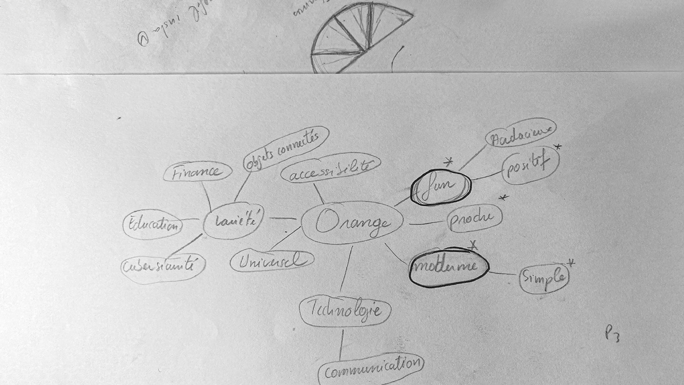
L'inspiration :
Après des recherches approfondies sur l'entreprise Orange, j'ai découvert son désir profond de refléter la positivité, la simplicité et la modernité. Armé de ces mots-clés, j'ai tracé un parcours créatif à travers mon mind mapping, qui a donné naissance aux résultats que je suis ravi de vous présenter aujourd'hui.
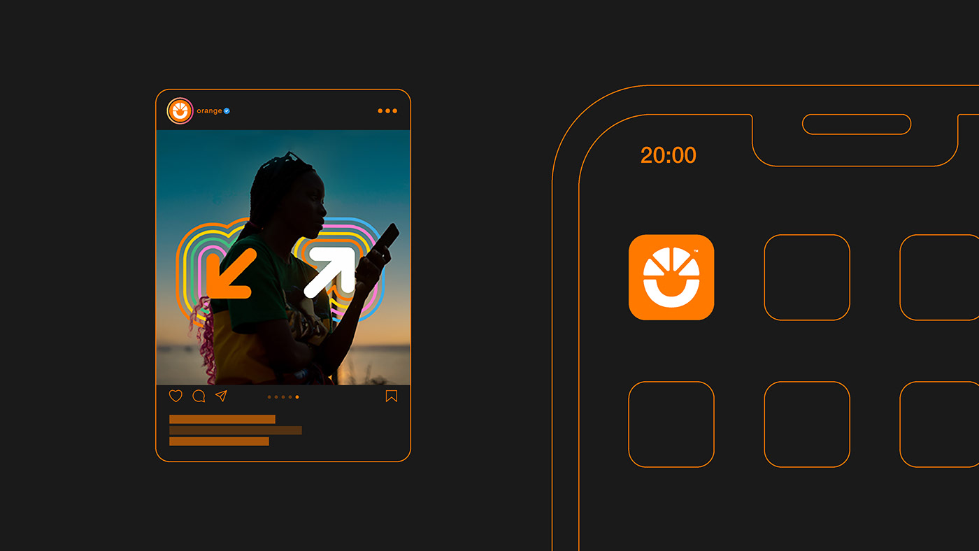
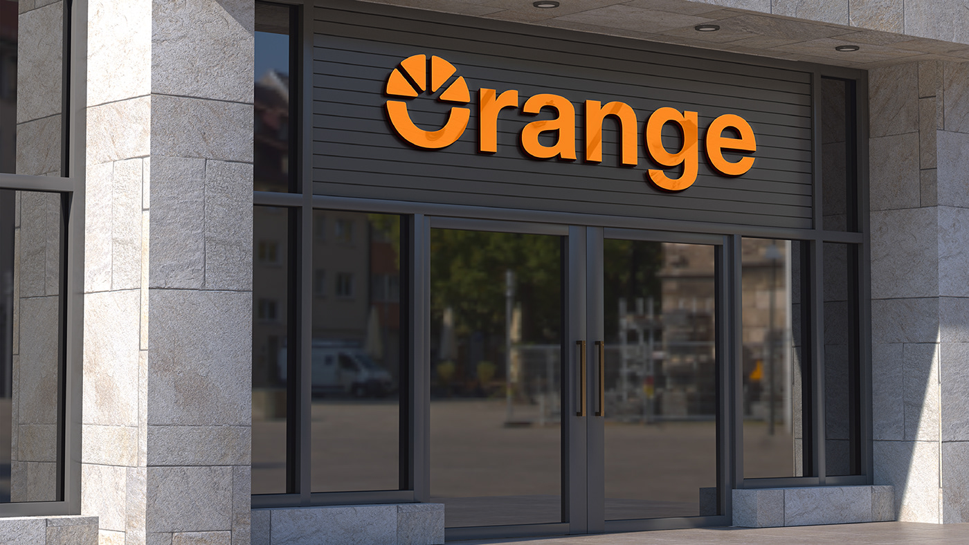
J’ai gardé la même palette sauf le noir que j’ai un peu éclairci. De même que la typographie Helvetica Neue que je trouve simple et moderne.
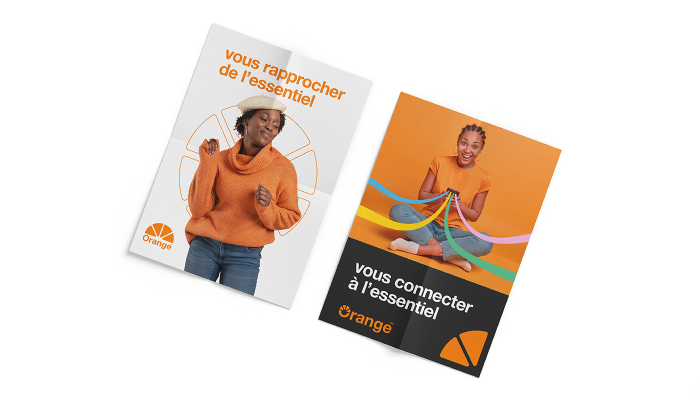
Avec ce redesign, je suis convaincu d'avoir créé un logo qui résonne avec la vision d'Orange, une entreprise résolument tournée vers l'avenir, la proximité client, et l'innovation. J'espère que ce voyage créatif vous inspire autant que moi.
EN
Redesigning the Orange Logo: A New Era of Connectivity.
I am thrilled to share with you this exciting project: the redesign of the iconic Orange logo, a true ode to modernity and connectivity.
The Challenge :
Embarking on this project, I felt the need to bring the Orange logo closer to the essence of the company. The old logo, while elegant, lacked the flexibility and modernity needed to represent a company focused on closeness with its customers. It was as if the logo had remained stuck in a too-serious universe, resembling more of a banking institution.
Embarking on this project, I felt the need to bring the Orange logo closer to the essence of the company. The old logo, while elegant, lacked the flexibility and modernity needed to represent a company focused on closeness with its customers. It was as if the logo had remained stuck in a too-serious universe, resembling more of a banking institution.
The Inspiration :
After thorough research on the Orange company, I discovered its deep desire to reflect positivity, simplicity, and modernity. Armed with these keywords, I charted a creative journey through my mind mapping, which gave birth to the results that I am delighted to present to you today.
After thorough research on the Orange company, I discovered its deep desire to reflect positivity, simplicity, and modernity. Armed with these keywords, I charted a creative journey through my mind mapping, which gave birth to the results that I am delighted to present to you today.
I kept the same color palette except for the black, which I lightened slightly. Similarly, I chose the Helvetica Neue typography, which I find simple and modern.
With this redesign, I am confident that I have created a logo that resonates with Orange's vision, a company firmly focused on the future, customer proximity, and innovation. I hope this creative journey inspires you as much as it does me.


Crédits
FR
Client : Orange
Domaine d’activité : Réseau
Année : 2024
Direction Artistique (D.A.) : Eugène Ndiolène
Direction Artistique (D.A.) : Eugène Ndiolène
Designer : Eugène Ndiolène
Images : Freepik - Orange
Merci de votre attention !
Si vous avez apprécié le projet, partagez vos avis ou feedback. Votre opinion compte !
Vous souhaitez collaborer avec nous ? Contactez-nous dès maintenant.
Email : infos@dican.tech
Téléphones : +221 77 117 44 25 | +221 76 418 82 86
Téléphones : +221 77 117 44 25 | +221 76 418 82 86
Suivez-nous sur les réseaux sociaux pour rester connecté avec notre créativité :
En savoir plus sur dican.tech
-------------------------------------------------------------
EN
Client: Orange
Business Sector: Network
Year: 2024
Artistic Direction (A.D.): Eugène Ndiolène
Designer: Eugène Ndiolène
Images: Freepik - Orange
Thank you for your attention!
If you enjoyed the project, share your thoughts or feedback. Your opinion matters!
Interested in collaborating with us? Contact us now.
Email: infos@dican.tech
Phones: +221 77 117 44 25 | +221 76 418 82 86
Follow us on social media to stay connected with our creativity:
Learn more at dican.tech


